How To Paint With Watercolors in ArtRage 4
Copying a traditional watercolor painting using ArtRage 4’s digital watercolor tools
This step by step tutorial uses the original ‘Gateway’ painting as a reference and demonstrates the process for copying the effects of watercolor using the watercolor tool, palette knife and other ArtRage 4 features. The reference painting is by artist Annie Wood, the tutorial is by ArtRage staff.
Download the full Watercolor tutorial for ArtRage 4 [PDF]
This art tutorial file come in PDF format, you will need a PDF viewer. If you do not have one, you can download: Adobe Reader
Optionally, see below for an online version…
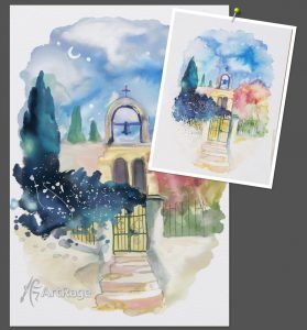
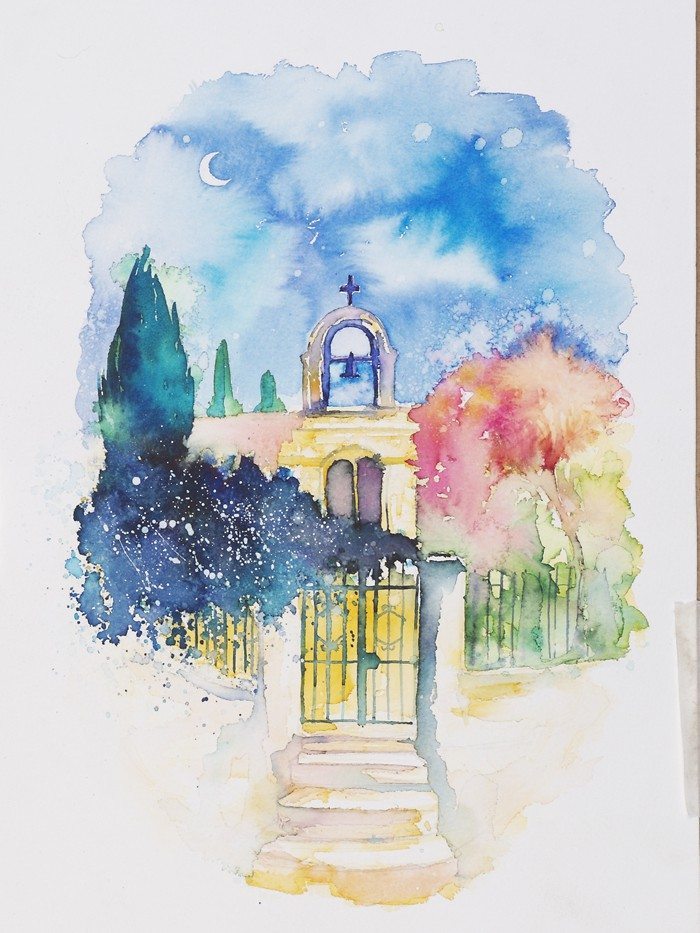
Reference Image: ‘Gateway’ by Annie Wood
The reference image used in this tutorial is ‘Gateway, Alonnisos, Greece’, a traditional ink & watercolour study by Annie Wood. The use of this image is for educational purposes only. Please contact the original artist if you wish to make use of her painting: www.anniewoodart.co.uk
About Annie Wood
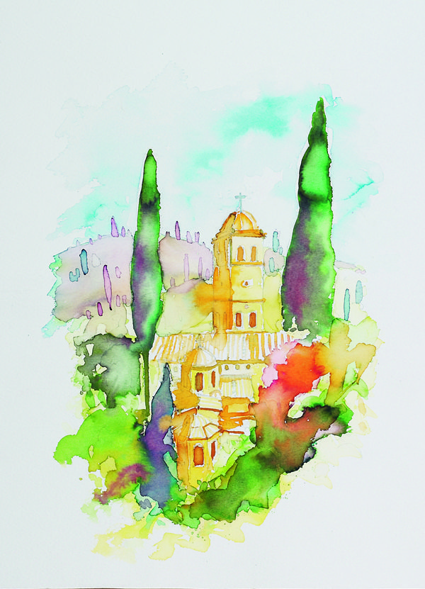
Annie Wood is the artist of the original watercolor painting used for this tutorial, and was kind enough to allow us to include it here. She is a landscape artist from the UK, who lives around the Dorset-Somerset border. She uses her work to explore hidden parts of nature, and capture experiences from her travels, as well as offering art therapy courses.
See more of her beautiful watercolor landscapes at www.anniewoodart.co.uk
The Tutorial
Part 1: Setup
You can just pick up the watercolor brush and start painting, but it helps to plan out a few things first. Create a sketch to work from – as detailed or sketchy as you like – on a separate layer, find some references to help you figure out what result you want to achieve, and test out the brush settings and color mixing, so you know how to actually get the result you want. You should also pay attention to the paper or canvas settings, as these can have a major effect on the way your paint flows.
You can do these things in any order, and you may want to play around with different options a bit before continuing to the actual painting.
Setup (1): References and Sketch
If you haven’t really painted with watercolors before, then you probably want to find some references showing you the effects that you want to create. You don’t have to copy them closely, but they will help enormously when you are trying to figure out what results you actually want and which effects are ‘realistic’ looking.
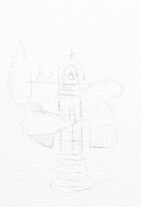
Lightly sketch stuff out in pencil to get a feel for the image and give yourself a guide to work from. I was deliberately ‘loose’ with my sketch as I’m not trying to exactly copy the original and I want to bring my own ‘feel’ to it. I also ended up not really using the sketch much after I got started, but it helped me define the first areas of paint.
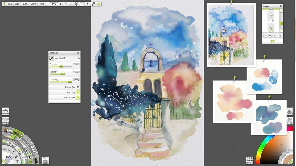
Setup (2): Color testing with Scraps
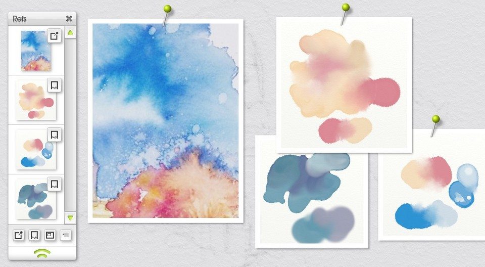
Above you can see that I’ve tested out a few color mixes on Scraps (found in the References menu). They helped me figure out what the colors would actually do when I blended them, and whether I needed to mix them directly or just go over them with a palette knife afterwards. This matters a lot more for the watercolor because anytime you use it with any of the wet blending options active, you change what you have already painted (you can’t just repaint it to get the result you want easily).
You can stop and test stuff on the Scraps at any point. I don’t always show you when I did, but I was testing stuff through most of this tutorial.
Setup (3): Canvas
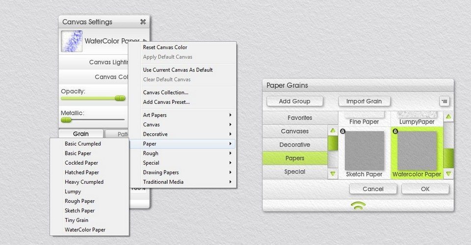
Go to the Canvas Settings to set the canvas color and grain (texture). You can use a default paper preset or a custom one. It’s generally best to stick to specific watercolor and paper canvas options as watercolor doesn’t work very well with rougher canvases.
In this example, I’m actually using a custom Parchment preset from one of our ArtRage artists, found at Juz’s ArtRage Addons.
I didn’t bother changing the background color for the first half of the painting because I wanted to see what I was doing, and I wasn’t sure what it would look like at the end yet. I came back and changed it a few times to check what it would look like at different stages. For the final result, I picked the paper color from the reference image and adjusted it slightly – when you have the color picker open, you can click anywhere on the screen to select a color (as the reference image is a scanned version of the original, the colors may not be exact, so I had to use my own judgement a bit when deciding how closely I wanted my version to match it).
General Tips for ArtRage Watercolors
Watercolors are a tricky tool, they’re unpredictable and changeable and translucent. They can always, always, be added to or blended further in ArtRage, so if you don’t like the look of it, just keep working.
The process of using them tends to be different to other tools as well. You have to keep building up the paint, layering, blending, thinning, spreading… the paint changes the longer you work.
Some rule of thumb tips:
- Use a paper grain preset for the background, not a ‘canvas’ preset or other grain
- You can import your own photos of papers/other people’s custom canvases as traditional paper textures if you don’t think the existing options are interesting enough
- If you need a defined edge of pigment, turn Paper Wet off, and set Thinners to around 50%
- If you need ‘dry brush’ texturing at the end of strokes, turn Loading down
- If you just need to lay a lot of blended paint down without effects, turn Paper Wet on and Loading up and Thinners down
- If you need to mix in and blend colors, turn Color Bleed up
- If you need a lighter area inside a darker area of paint, turn Thinners up and dab inside it
- Use the palette knives
- You can use Insta Dry to lay down paint exactly where you want it then blend it later
- If you need to build up visible, defined, layers or edges, turn Insta Dry on, Paper Wet off and Thinners up around 50%.
- You can use separate layers instead of Insta Dry.
- Always use the watercolor layer blend mode for any extra layers, unless you have a reason not to.
- Run a wet paintbrush along the edges of existing paint to soften and blend the edge
- Dab a wet paintbrush inside existing paint to add new color blends and patterns and effects
- Scrub away with a large wet paintbrush with high Thinners to create a fade out to nothing
- Duplicate the layer for a stronger pigment build up, then merge it down for a single layer of solid paint
- Did I say use the palette knives already? USE THEM.
- If something isn’t working, change the settings and try again
- Everything listed here can change depending on what you are painting over and what you actually want to do
- Test stuff on the Scraps before messing with your existing paint
- Switch Real Color Blending on and off for nicer or more predictable digital color blending results
- You can set Thinners and Color Bleed to react to pressure in the Stylus Properties
For the rest of this tutorial, click through the images below to read the steps, or download the complete tutorial as a PDF.
Part 2: Sky
[justified_image_grid ng_gallery=17]Part 3: Tree & Creeper
[justified_image_grid ng_gallery=19]Part 4: Gate and Steps
[justified_image_grid ng_gallery=20]Part 5: Arch and Alcoves
[justified_image_grid ng_gallery=21]Pause for Breath
Let’s take a step back and look at what we have so far. It almost looks like a real painting now! Watercolors change a lot as you work with them, and building up layers over time can make a big difference, so taking the time to appreciate how far you’ve come can be very motivating.

But it also helps to step back and spot problems with the overall image, after you’ve been buried in the details… It was at this point that I had realised I was painted everything tilted sideways so I went to Edit > Transform All Layers and rotated it until it was nicely vertical and centred.
And now we can finish the last bit!
Part 6: Red Tree
[justified_image_grid ng_gallery=22]Download the full ‘Gateway’ Watercolor tutorial for ArtRage 4 [PDF]
More ArtRage Watercolor Tutorials
[fp_carousel width=”940″ height=”200″ items=”5″ num=”-1″ speed=”600″ tag=”watercolors” orderby=”date” post_type=”post”]More General ArtRage Tutorials
[fp_carousel width=”940″ height=”200″ items=”5″ num=”-1″ speed=”600″ cat=”Tutorials” orderby=”date” post_type=”post”]For more help with using ArtRage, check out the ArtRage 4 Manual, the list of community tutorials. And don’t forget to check the FAQ section!
You can also drop by our Artrage Forums, or Contact our Tech Support directly.