Getting Traditional Watercolor Effects with ArtRage: A Tutorial from iPad Artist Randel Washburne
Introduction from the artist
ArtRage is one of several watercolor simulations, all with their own strengths and shortcomings. Auryn Ink and Tayasui Sketches emulate the watercolor process more accurately and can give nice results. Still, I prefer ArtRage best since I get the best results from it. The uses of the tools are less like true watercolors. I think of it as producing watercolor effects, not trying to paint like watercolors. And I have no reluctance to mix in the Airbrush or other tools too in the same painting.
Though I wrote this based on my iPad experience, all of these techniques work the same in the Android and desktop versions of ArtRage. After I wrote this initially, I sent it to Hannah at Ambient Design’s ArtRage tech support for comment, and have incorporated the additional insights Hannah offered as well.
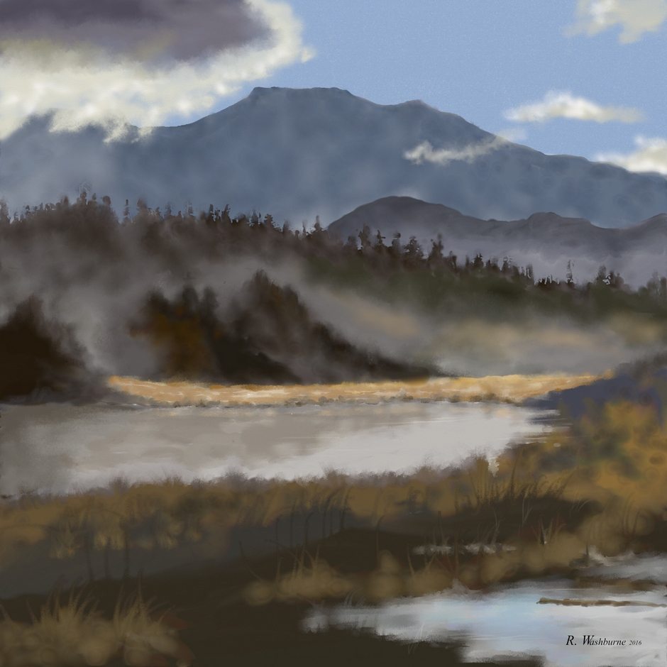
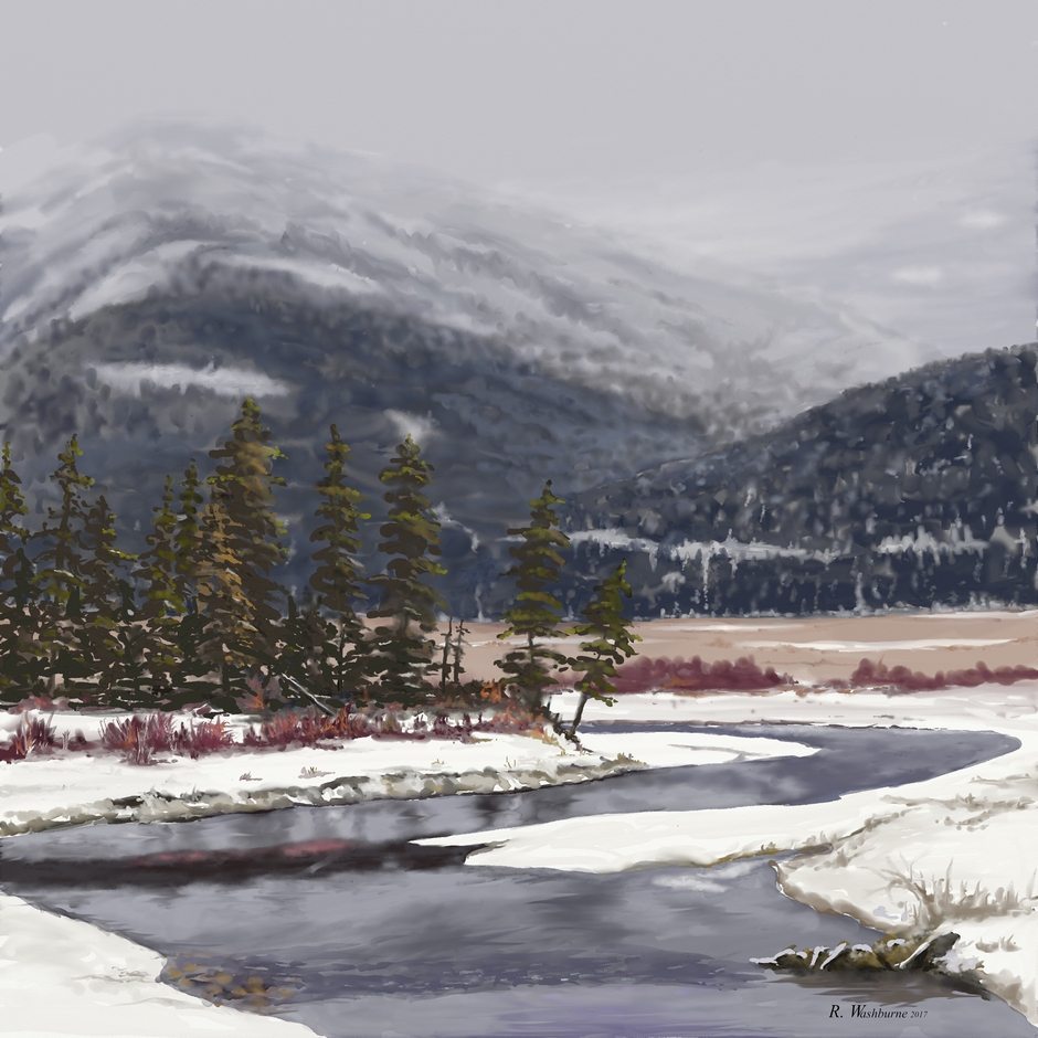
Watercolor landscapes painted in ArtRage for iOS. Learn more about the watercolor techniques used for these paintings at the end of this tutorial.
Watercolor Tool Settings
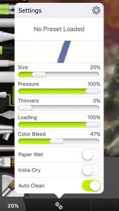
To begin, what canvas texture you use will affect your results, with the Watercolor or another smooth paper preset giving the best results. It can be set initially for the new painting, or changed at any time at the top of the layers menu, though that will not affect what has already been done. Figure 1 shows the standard settings for the watercolor tool.
I’ll be dealing mainly with three of the tool’s settings: Thinners, Color Bleed, and Paper Wet, but will have a few things to say about the others too, except for Auto Clean which I never turn off.
Pressure
First, how is the Pressure different from Size? Hannah’s comment: “Pressure for the brush tools just changes size. Changing pressure can affect the range of possible sizes if you have a pressure sensitive stylus and helps people fine tune their control over the brush size (especially as some people press harder than others), but if you’re getting results you like then you don’t need to change it.”
In short, there’s really no difference. But if you want to get the widest strokes for a big wash, set both to 100%.
Using Paper Wet
This is very important for smooth, even-value washes.
With Paper Wet off, strokes show and overlaps build on top of each other, as in the upper two washes in Figure 2. Strokes seem to be wider with Paper Wet too, making coverage easier. But there is no blending and when you make changes in hue, value or thinners there will be defined edges between what was painted last. Once I have an area covered as I like it, I almost always turn Paper Wet off to do the rest. For a graded wash, or to blend in other values or colors, Paper-wet should be turned off.
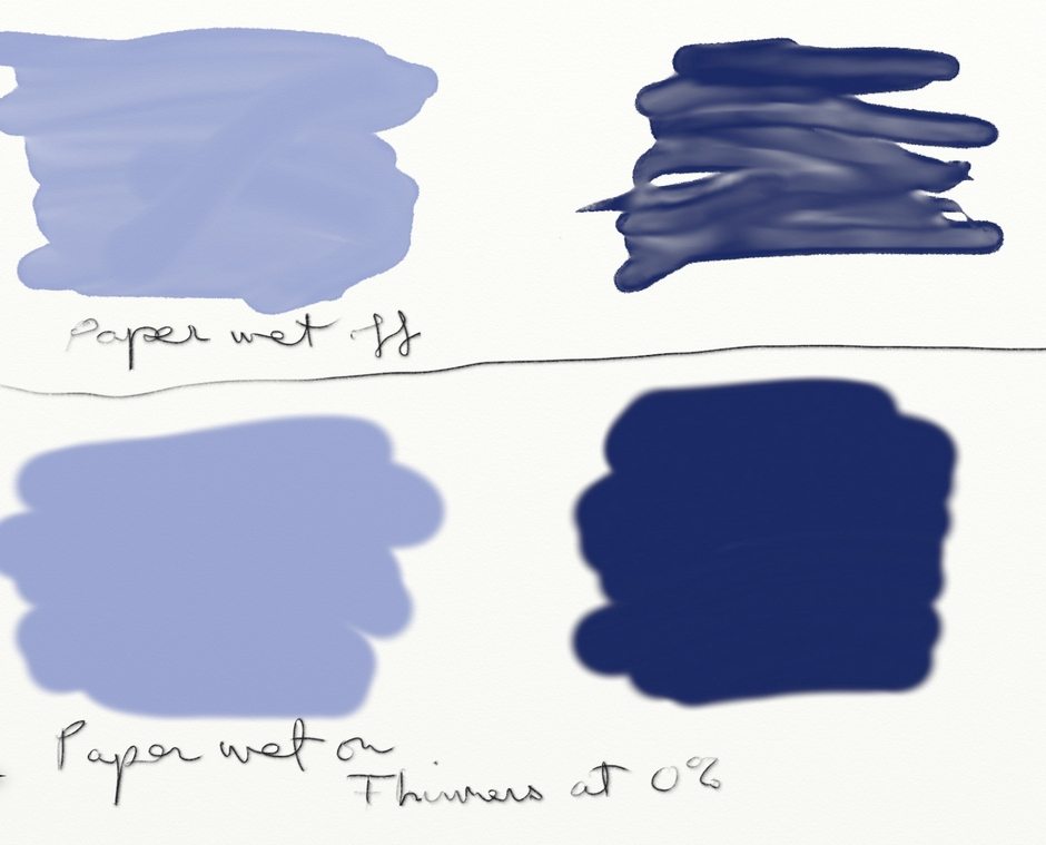
[Top] Paper Wet off
[Bottom] Paper Wet on, Thinners at 0%
![[Top] Wash with Paper Wet, Reduced Thinners [Bottom]Wash with Paper Wet turned off, Reduced Thinners Right] Color Bleed 100% in both](https://www.artrage.com/wp-content/uploads/Figure-3-by-Randel-Washburne-Watercolors-ArtRage-iOS-iPad.jpg)
[Top] Wash with Paper Wet, Reduced Thinners
[Bottom]Wash with Paper Wet turned off, Reduced Thinners
Right] Color Bleed 100% in both
In the upper wash in Figure 3, the bottom half is the same color, but thinned. Note that it doesn’t blend. In the lower wash, Paper Wet was turned off before applying the thinned area. Now it does blend, and will mix with the existing full strength paint. In this case Color Bleed is 100%, not the best for blending. More about that later.
For graded washes going from either full strength to thinned, or the other way, Start with Paper Wet to evenly coat the entire area. Then turn it off and slowly start adjusting the thinner, a small change makes a big difference.
Color Bleed
The Color Bleed slider is the most important for me. I am adjusting it constantly, and wish it could be kept in view. It seems to do something more than “color bleed” – mainly blending and controlling intensity of values. In short, what you get from Color Bleed is: 100% – least blending, most intense values 0% – most blending, least values.
Hannah points out that color bleed determines how much what you are putting down mixes with the existing paint (replacing it with high color bleed, mixing in a minor way with low color bleed). That’s why you may get different color results.
![Figure 4 [Top] Color Bleed 0% [Bottom] Color Bleed 100%](https://www.artrage.com/wp-content/uploads/Figure-4-by-Randel-Washburne-Watercolors-ArtRage-iOS-iPad.jpg)
[Top] Color Bleed 0%
[Bottom] Color Bleed 100%
At the top in Figure 4 the slider is all the way left – 0%. The purple and dark color on the wash are subtle. The edges blend with the brown wash. At bottom, with 100% color blend, the purple and dark are much stronger, and don’t blend into the brown. You won’t get soft edges.
Instead, set the slider toward 100% to establish the new paint in the area and intensity that you want it. Then cut it back toward 0% and soften and blend the edges. The dark green washes in Figure 5 below were done with Paper Wet, then turned off to apply the thinned paint. The effect of changing the Color Bleed is apparent, but I don’t think Color Bleed makes much difference if Paper Wet is on (see Figure 6).
![Figure 5 [Top] Color Bleed 100%. Both washes with Paper Wet on, Thinners reduced, varying Color Bleed [Bottom] Color Bleed 0%](https://www.artrage.com/wp-content/uploads/Figure-5-by-Randel-Washburne-Watercolors-ArtRage-iOS-iPad.jpg)
[Top] Color Bleed 100%. Both washes with Paper Wet on, Thinners reduced, varying Color Bleed
[Bottom] Color Bleed 0%
![Figure 6 Paper Wet washes, then blue added [Upper Left] Paper Wet left on, 100% Color Bleed [Upper Right] 0% Color Bleed [Lower Left] Paper Wet turned off, 100% Color Bleed [Lower Right] 0% Color Bleed](https://www.artrage.com/wp-content/uploads/Figure-6-by-Randel-Washburne-Watercolors-ArtRage-iOS-iPad.jpg)
[Upper Left] Paper Wet left on, 100% Color Bleed
[Upper Right] 0% Color Bleed
[Lower Left] Paper Wet turned off, 100% Color Bleed
[Lower Right] 0% Color Bleed[/caption
Note in Figure 6 that the effects of changing Color Bleed seem somewhat less when Paper Wet is left on. It still seems preferable to me to turn it off before trying to blend into a wash.
Using low Color Bleed (slider set to left) is a challenge but rewarding. It’s hard to add values, but you get nice blending effects. Each time you put the brush down, it deposits some paint – a weak dot (depending on brush size) that may have concentric rings. So keep tapping to build up what you need. Keep the dots fairly close or you may not be able to blend them, giving a blotchy look, as in the lower right wash in Figure 6.
After you’ve put down enough paint, keep the brush down and spread it around and blend it with the existing paint. Starting a new stroke deposits more, so finish to the effect you want before lifting the brush.
Palette Knife Blending
After laying down a wash, either paper wet or dry, an alternative to blending by varying color bleed is to use the wet palette knife presets, which work the best for watercolors. As Hannah notes, this may be the easiest way to get the blended effects you want, and suggests starting with the Hard Wet Blender or Heavy Blurred Frosting presets.
Insta-Dry
I rarely use Insta-Dry, but it has its use when you want sharp contrast and hard edges. Keep in mind that each layer represents wet paint, so a dry glaze is done in any of three ways: using Instant Dry, drying with the eraser, or painting on another layer.
In the upper wash in Figure 7 I applied yellow with different Color Blends to get different effects and edges. The yellow absorbs into the purple with diminished value contrast. In the lower wash, I turned on Instant Dry to apply the yellow. Then I turned it off and used low Color Blend to soften it at the right. Or of course use the palette knife blender.
[caption id="attachment_128996" align="aligncenter" width="940"]![Figure 7 [Top] Varying Color Bleeds [Bottom] Insta Dry, then Insta Dry turned off to blend with low Color Bleed](https://www.artrage.com/wp-content/uploads/Figure-7-by-Randel-Washburne-Watercolors-ArtRage-iOS-iPad.jpg) Figure 7
Figure 7[Top] Varying Color Bleeds
[Bottom] Insta Dry, then Insta Dry turned off to blend with low Color Bleed
A somewhat questionable alternative to Instant Dry is to use the eraser as a dryer for the existing paint on the same layer. You turn the eraser into a dryer by setting the pressure to zero. Scrub over an area, but you won’t see any change – no erasing. But it is drying. Then come back over it with paint and you should see that area acting more like a glaze over dry paint in the area you “erased”.
In Figure 8, I dried a strip across the center of the wash as shown. Then I applied the vertical stripes.
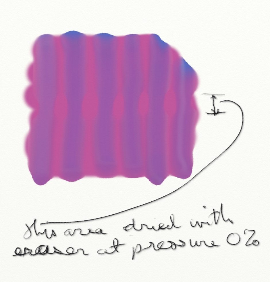
Horizontal strip in center dried with an eraser at 0% Pressure
You can see that there is a subtle difference – a bit harder edges if not more intense value. I haven’t worked with this very much, so I’m not sure of its worth. You can’t see what you dried, and the results are uncertain. Hope someone else will experiment and report.
Thinners
Adjust slowly, since small changes make a big difference. Thinning can sometimes give your color a grey cast that I don’t like. It’s important to thin paint in a Watercolor Blend layer in order to have the underlying layer’s color come through.
Within a wash, leaving Paper Wet on results in even changes to an area you go back over with a new amount of thinners. Strokes don’t show or overlap, as noted in Figure 2, and how Color Bleed is set makes no difference. So, to do anything interesting within a wash turn Paper Wet off. Then adjust color bleed to suit how you want the thinned area to look – more for sharper edges, less for softer blending. Using lots of thinners can produce some ethereal effects inside washes or along the edges.
In Figure 9, the upper wash was done with Paper Wet, then turned off to do the work outside the edges. The lower wash was done with Paper Wet off throughout. Again with Paper Wet on, you won’t get any blending.
![Figure 9 Top: Paper Wet on for a wash. Start inside wet area, scrub into it. [Center] Feathering edges with 100% Thinners. 0% Color Bleed on left, 100% Color Bleed on Right. [Bottom] Paper Wet off for wash](https://www.artrage.com/wp-content/uploads/Figure-9-by-Randel-Washburne-Watercolors-ArtRage-iOS-iPad.jpg)
Top: Paper Wet on for a wash. Start inside wet area, scrub into it.
[Center] Feathering edges with 100% Thinners. 0% Color Bleed on left, 100% Color Bleed on Right.
[Bottom] Paper Wet off
for wash
To add thinned areas outside a wash, start painting outside the wash and work toward its edges. Set Color Bleed either way depending what effect you want. With high Color Bleed, at the right in Figure 9, you’ll get hard edges as you touch the dark wash. You can also get some nice rounded shapes as in the upper right. With low color bleed, at left, note that you can pull the dark color out and get a softer gradient.
You could also use the Smudge or Smear settings in the Palette Knife tool to pull some of the dark color out into the thinned area, and then mix it up with the low bleed brush.
Layer Blend Modes
The idea is that two layers are used to simulate a glaze over a dried wash, with the colors and values of the underlying wash coming through the glaze. To do this, the lower layer’s Layer Blend Mode remains as Normal – there’s no point in changing it. The upper Layer Blend Mode can be changed to Watercolor, Multiply, or a variety of other setting that interact differently. Watercolor blend is intended to interact like physical paints do. Hannah notes that Watercolor blend mode is intended to give the same result as using Insta-Dry on the same layer, but done on multiple layers to give more freedom.
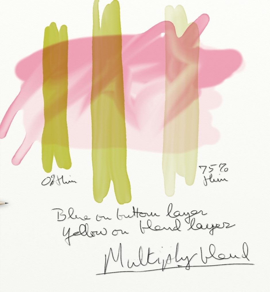
Figures 10 to 12 show the differences. The important thing to note is that opaque values on the upper layer don’t blend. Thinned paint does. The differences here are subtle. There seems to be no difference between Watercolor and Multiply in this example.
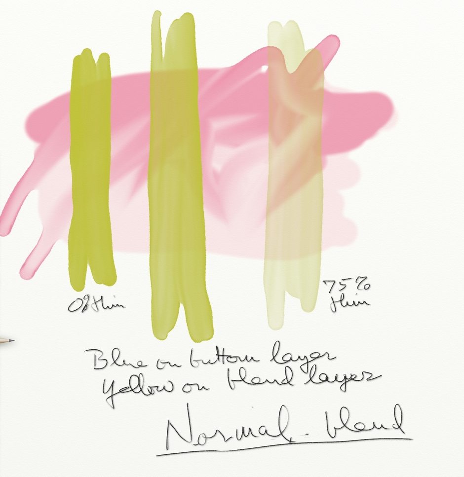
Left to right strokes: O% to 75% Thinners
Caption: Pink on Bottom layer, yellow on blend layer, using normal (no) blend mode.
Left to right strokes: O% to 75% Thinners
Caption: Pink on Bottom layer, yellow on blend layer, using Watercolor Blend Mode
Left to right strokes: O% to 75% Thinners
Caption: Pink on Bottom layer, yellow on blend layer, using Multiply Blend Mode
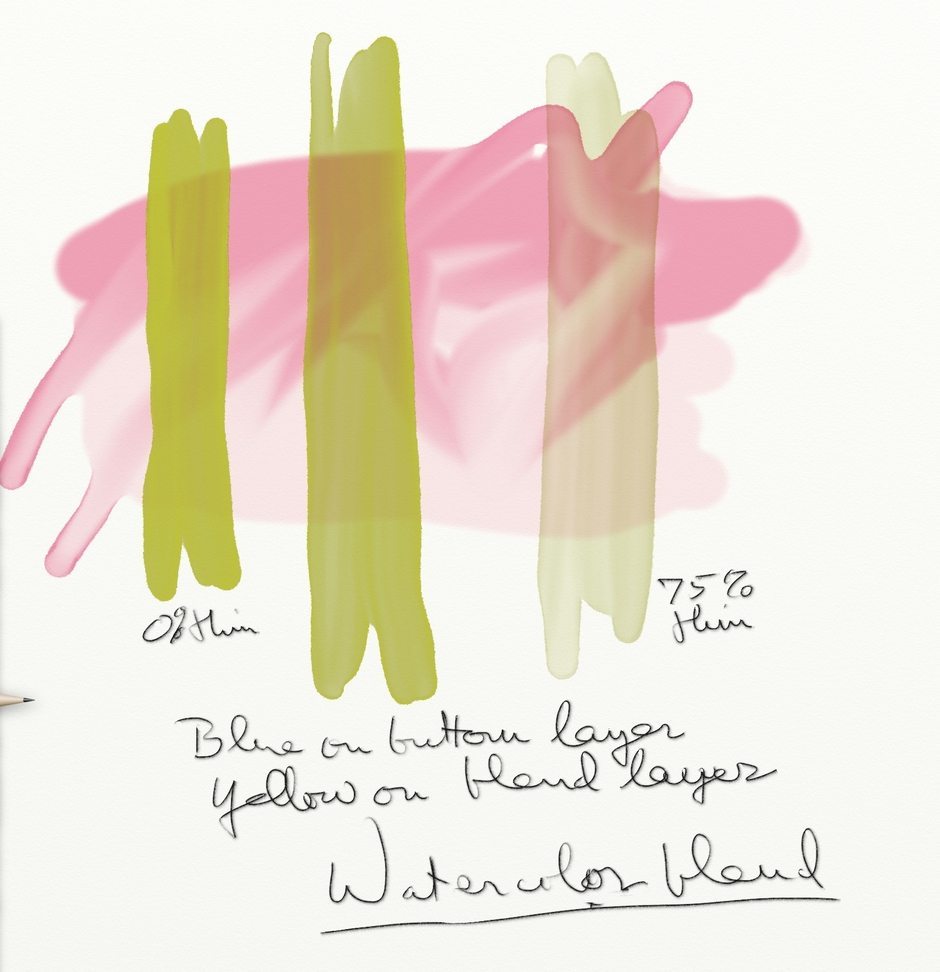
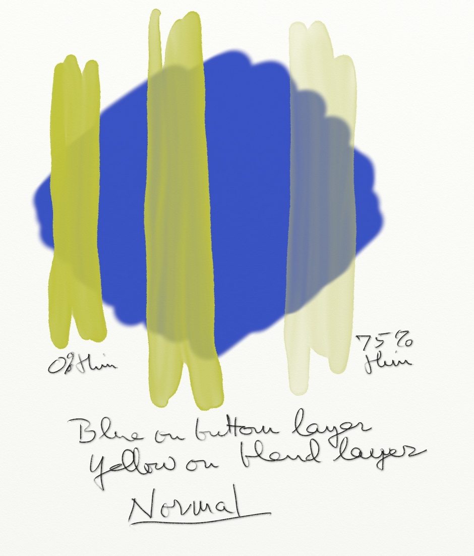
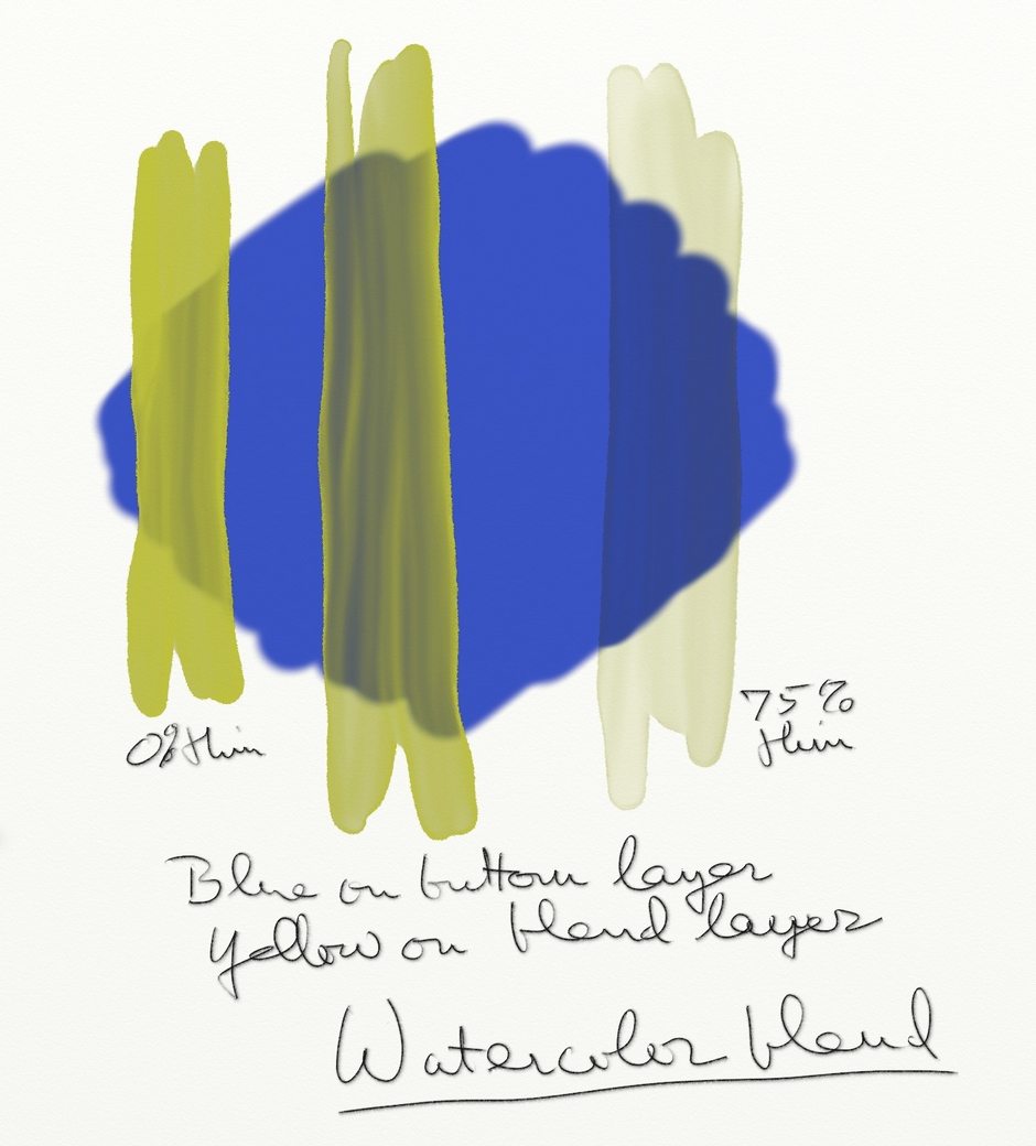
Light colors over a dark layer don’t work very well, as shown in Figure 14. They just darken in Watercolor Blend and take on the underlying hue where they are thinner. Hence, it seems to me the only potential for layer blending is for different hues of roughly equal value, preferably lighter ones.
Left to right strokes: O% to 75% Thinners
Caption: Blue on Bottom layer, yellow on blend layer, using normal (no) blend mode.
Left to right strokes: O% to 75% Thinners
Caption: Blue on Bottom layer, yellow on blend layer, using Watercolor Blend Mode
The jury’s still out on layer blending for me – I’m still learning about when to use it to advantage over painting on a single layer, and one example is included in my paintings. Of course one advantage is that you can manipulate or edit either layer separately. I hope someone will do some experiments to see find some good uses.
Example Watercolor Paintings
Last, a bit about how I did some of the paintings using the watercolor tool primarily.
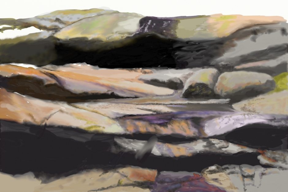
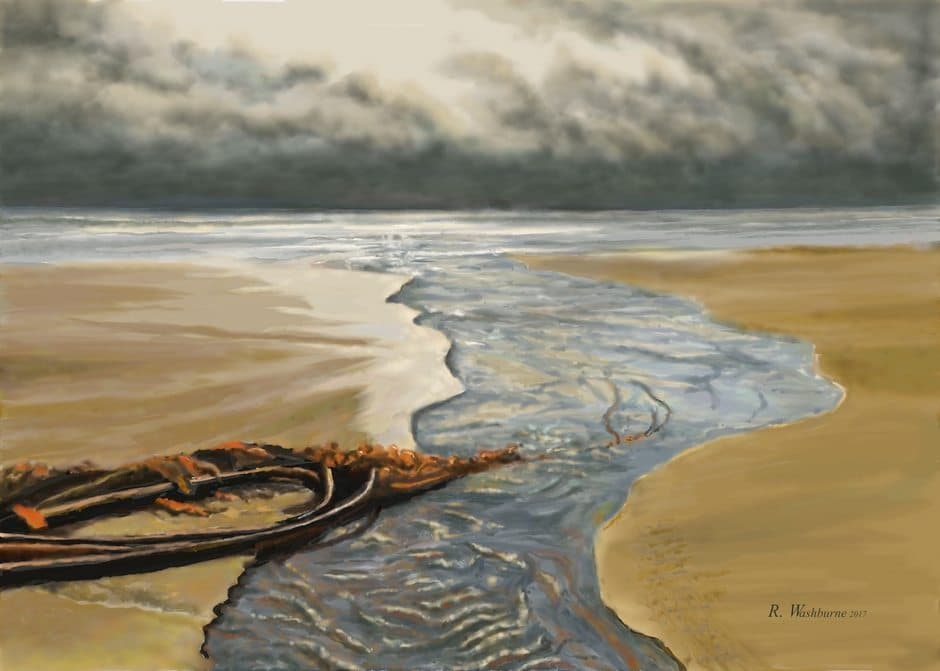
South From Astoria.
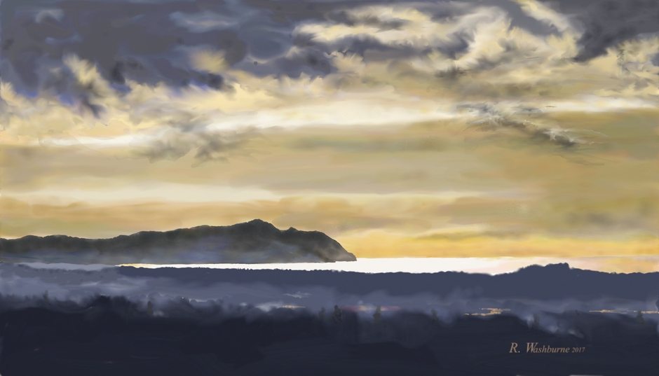
This one was done six layers, all set to normal blend.
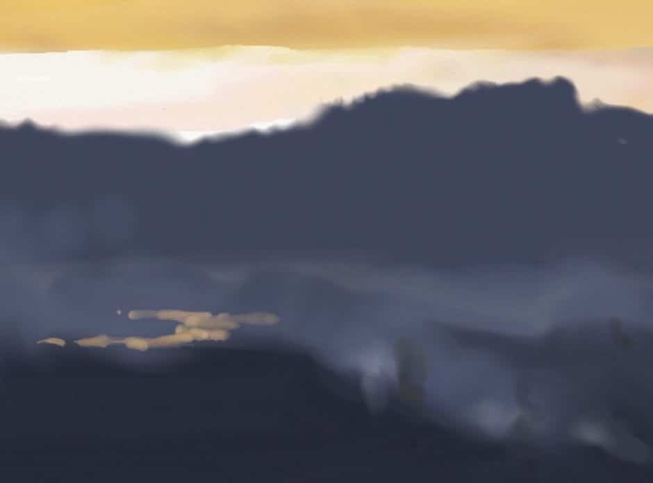
The lowland in the foreground was all one in one layer (Figure 15). First I laid down the dark color with Paper Wet 0% thinners, changing the value several to set apart the nearest. Then I turned of Paper Wet, added just a little thinner, and set Color Bleed toward the low (left) end. I used that to scrub in the light foggy areas, varying the amount of thinner here and there. Leaving Bleed low, I reduced the thinners and used a small brush to drag the dark foreground upward to suggest trees on the nearest ridge.
For the golden reflection on the waterways I set Color Bleed toward 100% and used a small brush to get the strong value. It looks good overall, but I should have reduced the Bleed at the end to soften and smooth it a bit.
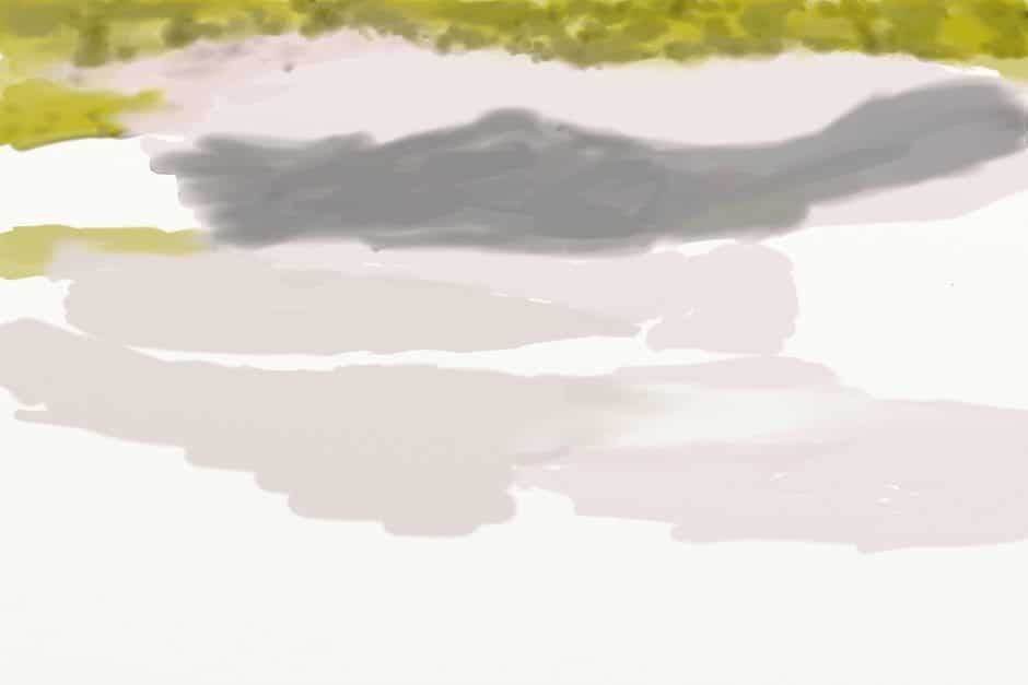
In Figure 16 the dark clouds are on a separate layer from the lighter amber clouds, being a lower cloud deck. I wanted to work in a wispy feathered edge on them. I had trouble reproducing these effects, so I’m guessing a bit.

Doing this required Color Bleed at zero (left), and thinners at 100%, or close to it. Brush the area outside the dark cloud first, and then start scrubbing into it without lifting the brush, working it in and out of the dark, which should start pulling some of the dark out into the new area without diluting the dark too much. This is very tricky and will require a lot of ReDo’s. Try wetting out first with a larger brush, then reduce it for the scrubbing.
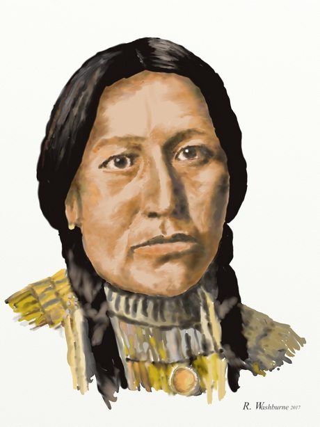
Daughter Of American Horse.
This was one of nine portraits I’ve done in ArtRage from photographs of Native Americans by Edward Curtis, taken in 1903-4. The others were painted with the airbrush, and this was the first using the watercolor tool.
Two layers were used – one for the face and the other for the hair and torso. The face started with a wash of the highlight color, followed by a lot of back and forth with the Color Bleed to round out the darker shadows, and a bit of blending with the Small Frost setting. Not as smooth as airbrushing, but I was pleased with it.
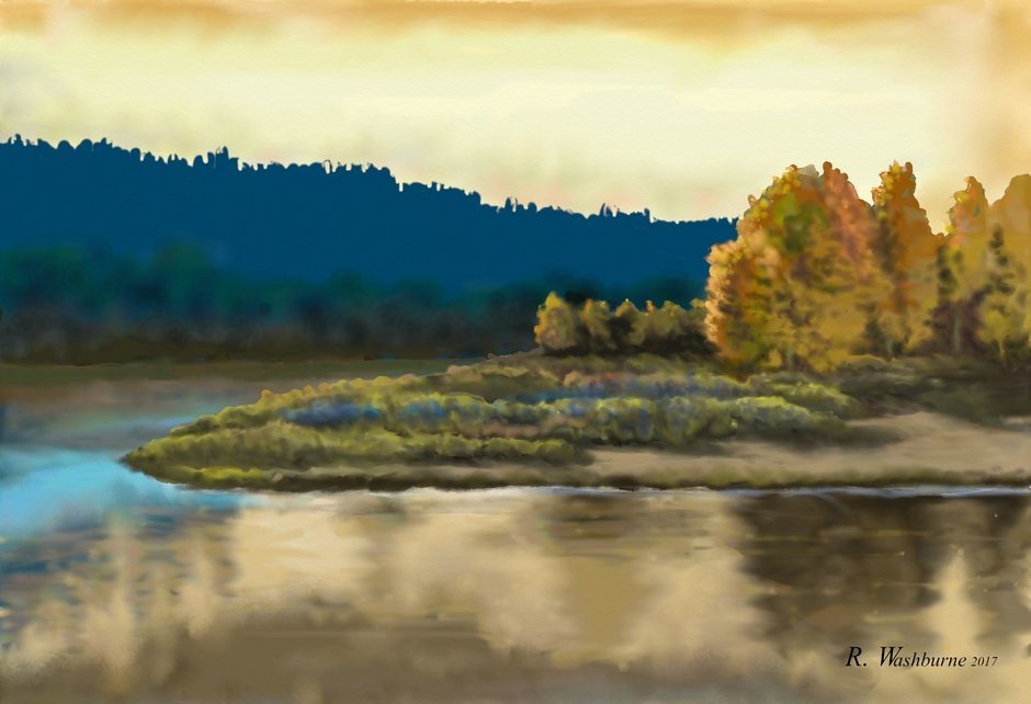
Headwaters Of Rio Tormes.
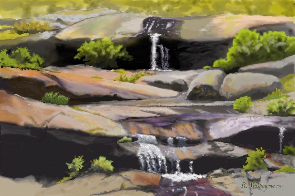
Most of this was done with two blended layers. Figure 17 is on top, set to Watercolor Blend, and Figure 18 is on the bottom. Compare these to the painting and you can see the effects, which are subtle at best as much of the upper layer is too dark and opaque to blend well.
Lower Elwha River.
This one used a lot of palette knife blending, particularly the smear tool for water reflections. The mist and white cloud edges were done with the air brush. For the sharp ridgelines I used Lock Transparency on that layer to drag dark color up against the edge without going over it. Works fairly well, but if you stroke away from the transparent edge it leaves a white spot. Also good for blending the upper mountain slopes without going above the ridgeline.
Lamar Valley.
A lot of fun with thinners and low Color Bleed on the mountain slopes and smear blending on the river surface.
Bull Kelp.
Just two layers, separated at the horizon. Use of 100% Color bleed to get the contrasts in the water and kelp strands.
Bend In The River.
Six non-overlapping layers. Some exaggerated hues and saturation. Lots of smear blending on the river. Skyline suggestion of trees was done by erasing into the layer.
About Me.
I’ve been drawing and painting all my life, on and off, with long dry periods. I once told someone I considered myself a pretty good technician, but not an artist because I lacked the fire to keep at it and growing. Since discovering painting on the iPad three years ago, I feel I’ve become an artist. What’s different? Besides the easy portability and lack of material expenses, I just like my results so much better. I’m motivated, still learning, and looking forward to new discoveries. The Facebook groups iPad Painters, The Mobile Artists Collective, and iPad Artists are my galleries.