How to Illustrate A Book Cover Part Two: Sketching, Flats and Shading (Tone)
An ArtRage 5 tutorial by Nick Harris
In this three part tutorial, Nick Harris uses ArtRage 5 to design a book cover from scratch and share some of his experience and techniques.
This tutorial assumes that you are somewhat familiar with ArtRage 5 and covers customising the canvas resolution and interface, guides, toolboxes, the Custom Brush, filters, layers and advanced layer properties, standard painting tools (Pastels, Pencil, Palette Knife, Watercolor Brush), symmetry, text, stencils, transform and tool presets. If you need help understanding any of the tools mentioned, see the online manual or browse the tutorial section for a more introductory tutorial.
Nick Harris is a professional illustrator and long time ArtRage user. See more of his work at nickillus.com.
The Book Cover Tutorial
This tutorial is broken into three sections and is available as a single video. You can also watch a video of the process of creating Custom Brushes for this tutorial.
- Part One: Setting Up Your Canvas and Workspace
- Part Two: Sketching, Flats and Shading (this page)
- Part Three: Colour and Special Effects
Watch the entire tutorial as a video
You can watch the complete tutorial series as a single 40 minute video. The content covered on this page (sketching and adding tone) starts at 4.18 and finishes at 11.20 minutes into the video.
Part Two: Designing The Cover
Part two demonstrates sketching the design and laying out the main elements of the composition, then adding flat colours and tone to plan the shadows and lighting.
Planning A Cover Design
The purpose of a cover is to attract a would be reader to pick up whatever the publication is. ‘Attract’ is the most important word in that sentence. The cover is the lure, the bait to snag your reader. If you take the time to peruse the shelves of a book shop or newsagent, you’ll quickly realise that while most covers are tailored to attract different types of readers, they usually display certain common traits.
Image and/or type tend to be bold to catch the eye. – Although the opposite may be used to stand out among a crowd doing that! Composition tends to revolve around something centrally placed (dependent on text content placement of course). Main title is often as important a factor as the image. Those two considerations are the ones we’ll take into account.
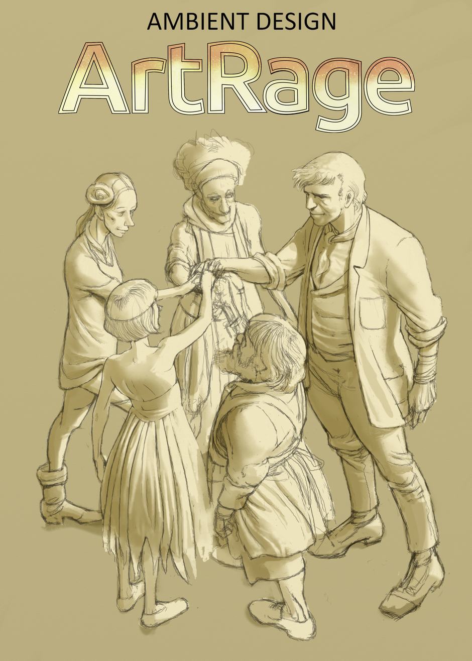
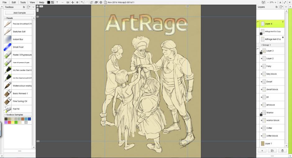
For the sake of this exercise I’ve invented a bunch call the Artrage Five. Five characters who feature as the the focus of the piece. The initial idea is to depict a group of five characters – the ‘ArtRage 5’. Coming from a background of working in children’s publishing, as I do, they’ll have a leaning towards fantasy stereotypes, but will need a little twist to personalise them to the particular theme.
Click through the images below to see the sketching, text, and basic shading stages covered in part two of this tutorial.
[justified_image_grid ng_gallery=39]
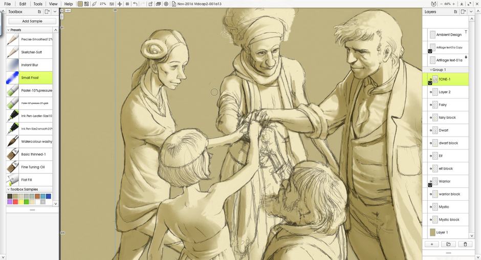
Sketching
Sketch out the basic illustration.
Pick whatever tools you prefer to work with. For me that means a Pencil set to ‘Precise Mode’. I begin sketching each character on a separate layer. This allows me to move them around, alter their scale, and such if it becomes necessary. I’m working straight in without any preparatory roughs and things will be worked out as I go. A big strength of the digital process is that it’s usually more flexible than real media, because it’s so much easier to correct mistakes.
I sketch a tallish man (hero type), dwarf, slight girl (fairy type?), Taller, slim girl (elf type?) and what will be either some sort of creature or an older lady (as yet undecided). Each is drawn on a separate layer. The group are in a ring facing each other and making some sort of bond/pledge, placing their right hands on a column that may become a pencil, paintbrush, or stylus. Really got it nailed down, haven’t I? That’s why I keep the drawing fairly loose while I flounder around, changing my mind and adjusting things.
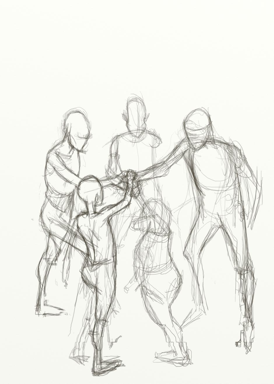
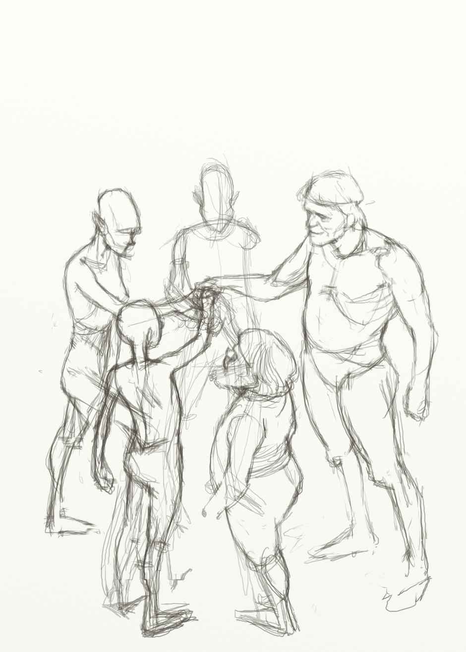
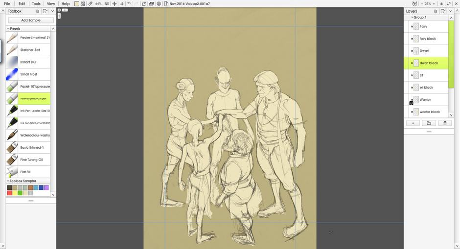
I fiddle around, drawing, redrawing, and adjusting the positioning of the figures both as a group on the page, and relative to each other. I leave room in the top third of the canvas for placement of the text. When I want to consolidate the forms, I bucket fill a darker tone into the background.
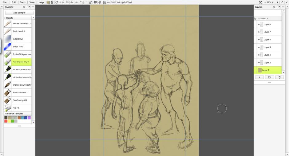
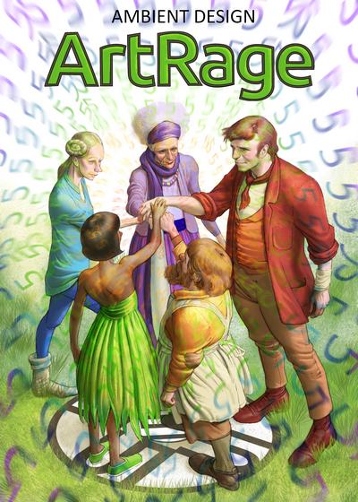
The darker background allows me to block a lighter, solid colour in behind the figures (using the pastel/chalk tool). This again is done on separate layers behind each appropriate drawing layer. You could create layer groups for each figure’s layers at this point, if you think it will help your organisation. I choose not to, I can do that later.
You should now be able to get a clearer idea of the over all shape of your group, as they are picked out against the darker tone.
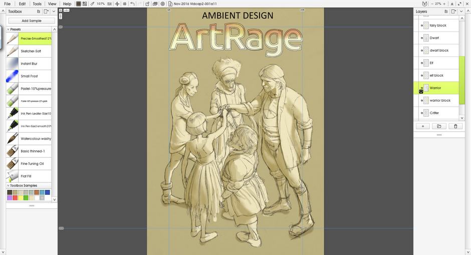
Adding the Title
For the main title text I traced around the official logo in a vector software to save myself time, and so that I could enlarge it without degradation of pixels. Vector lines will allow this because they work by mathematics not pixels. ArtRage is a pixel based software and does not need the added bloat of trying to be a vector software as well.
I use the internal type tool later on for other text (more about that in section 4), but import the prepared title text ‘to layer’. This allows me to move it around and place it. Be aware though that once you start manipulating it in ArtRage it has already lost its vector properties and is now pixel based. Enlarging or deforming it too much will degrade its crispness.
Tone
Add a layer of shadow to the figures.
Wanting to define the form more, I add a layer set to ‘multiply’ blend mode above the others which I paint raw umber (ish) watercolour washes into. This is to introduce shadows that will lay over the solid colour and bolster any work I do on those solid colour layers. It also helps to unify the scene by having shadows with the same colour cast on all the figures. That’s not counting reflected light and secondary light sources, which we can introduce later if needed.
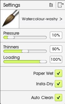
Some tweaking with brush settings for the Watercolour Brush a while ago led to me saving a custom brush preset that I call ‘watercolour washy’ (settings are shown on the right). It suits me because it emulates the sort of washes I use in real media watercolour. You may hate it, so I would suggest playing with the settings until you find something that you like. We all like different things.
I imagine the main light source shining down from high on the front right, which means that the figures have shadows down their left sides (as we look at them) and onto the ground in that direction. I paint the shadows loosely, building up tone, before working back into it with eraser to clean some edges and pick out details, and the palette knife to soften other edges for curved surfaces and such.
To strengthen the dark areas I create another wash layer above the first, this time giving it a colder hue. Having several shadow layers like this can give you finer control, but also allow for broader actions like reducing the opacity of the entire layer to make quick colour cast/lighting adjustments.
Ready for Colour!
The illustration is now ready to add colour, in part three of this tutorial.